Decodifying WCAG 2.1: Plain English Guidelines for L&D Professionals
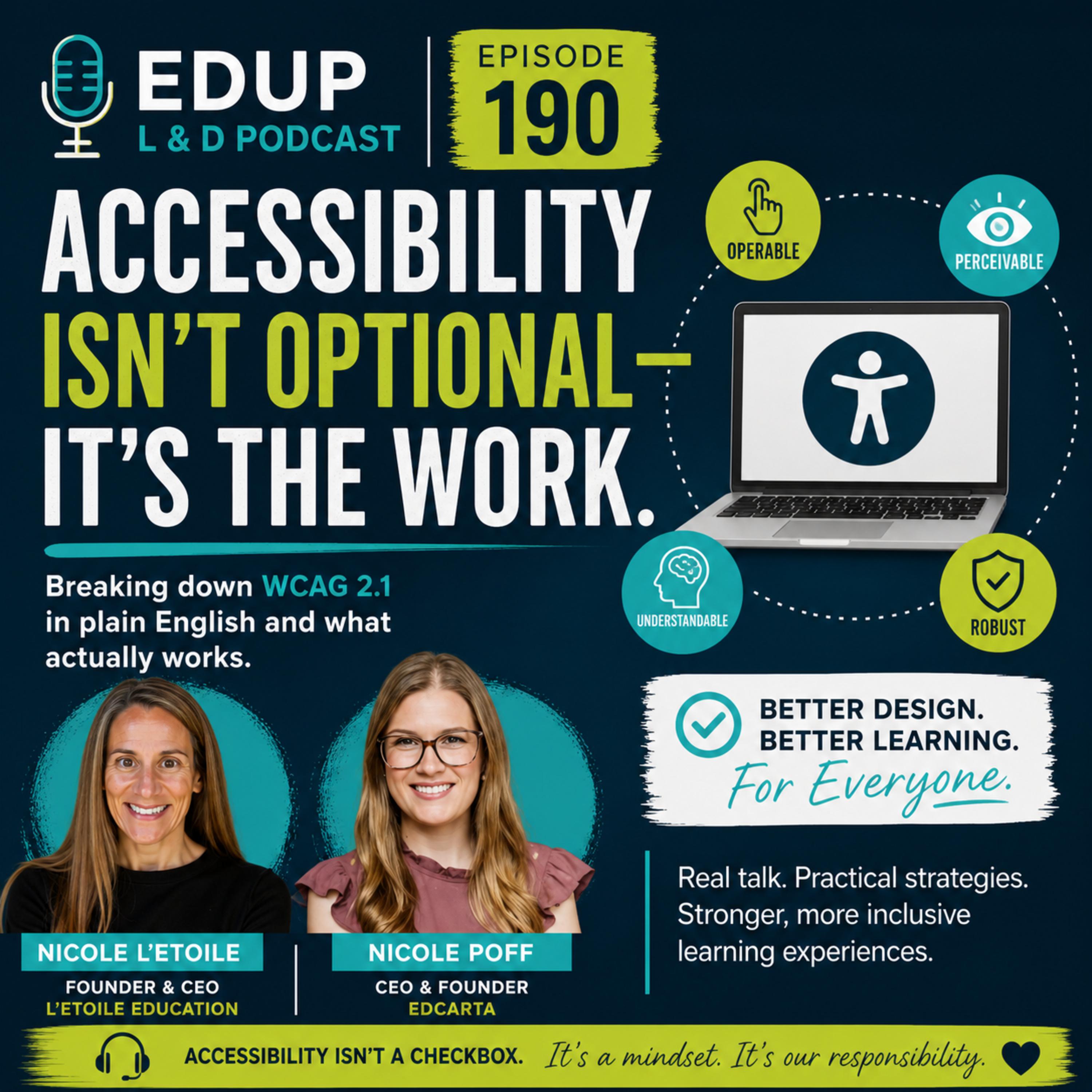
Welcome back to the EdUp L&D blog! If you are an instructional designer, trainer, or learning and development (L&D) professional, chances are you have heard the acronym WCAG tossed around quite a bit. Maybe you have even broken out in a cold sweat trying to decipher what a "success criterion" actually means for that interactive module you are building in Articulate Storyline or Adobe Captivate. Accessibility is a non-negotiable part of modern instructional design, but the documentation surrounding it can often feel like reading a foreign language written by lawyers and software engineers. That is why we recently sat down for an amazing discussion on the podcast to break down these guidelines into straightforward, human concepts. If you have not listened to it yet, make sure to check out Episode 190: WCAG Without the Overwhelm: Practical Accessibility for L&D to catch the full conversation. In this post, we are going to expand on those ideas, cut through the jargon, and give you a plain-English guide to tackling WCAG 2.1 without losing your mind.
Demystifying WCAG 2.1 for Instructional Designers
When most L&D professionals first encounter the Web Content Accessibility Guidelines (WCAG), they see a massive matrix of numbers, levels (A, AA, and AAA), and technical requirements. It is enough to make anyone want to close their browser tab and go back to designing static PDF handouts. But let us take a deep breath and demystify what WCAG actually is. At its core, WCAG is simply a set of recommendations designed to make digital content more accessible to people with a wide range of disabilities. For instructional designers, this includes learners with visual impairments, auditory processing issues, motor skill challenges, and cognitive differences.
The framework is built around four foundational principles, often remembered by the acronym POUR: Perceivable, Operable, Understandable, and Robust. Let us translate these into L&D terms. Perceivable means your learners can see or hear the information you are presenting; you cannot hide critical learning inside an image or a silent video. Operable means they can navigate through your course regardless of whether they are using a mouse, a keyboard, or assistive technology like a screen reader. Understandable means the user interface and the instructional language are clear, predictable, and not overly confusing. Finally, Robust means your content works reliably across a variety of browsers, devices, and modern assistive technologies. When you look at WCAG 2.1 through the POUR lens, it stops looking like an intimidating engineering manual and starts looking like a recipe for good, empathetic instructional design.
Why Relying Solely on LMS Accessibility Scores Falls Short
One of the biggest traps that L&D teams and higher education institutions fall into is trusting the automated accessibility checkers built into their Learning Management Systems (LMS) or course authoring tools. You run a scan, see a nice green checkmark or a score of 98 percent, and you pat yourself on the back, assuming your course is fully accessible. Unfortunately, the real world is rarely that simple. Automated checkers are fantastic tools for catching low-hanging fruit, but they can only detect a fraction of actual accessibility barriers.
Think of an automated checker like a spell checker in a word processor. It will tell you if a word is misspelled, but it cannot tell you if you used the wrong word entirely in the context of your sentence. Similarly, an automated tool can tell you if an image has alternative text applied to it. However, it cannot tell you if that alternative text is actually meaningful. If your alternative text for a complex data chart simply reads "image," the automated checker will pass it because text is present. But to a visually impaired learner relying on a screen reader, that alternative text is entirely useless. Furthermore, automated checkers often fail to evaluate the logical reading order of interactive elements, the nuances of cognitive load, or whether a video has accurate, synchronized closed captions. Relying solely on these scores creates a false sense of security, leaving learners behind while masking compliance gaps.
Common Accessibility Mistakes Institutions Are Making Today
As digital learning continues to expand, organizations and universities are making recurring mistakes when it comes to implementing accessibility standards. Identifying these pitfalls is the first step toward avoiding them in your own design practice. One of the most common missteps is treating accessibility as a retroactive cleanup project rather than a proactive design strategy. Many teams build an entire course, complete custom animations, complex branching scenarios, and gorgeous graphics, only to hand it over to an accessibility specialist at the very end with a request to "make it accessible." At that stage, retrofitting accessibility is frustrating, expensive, and often results in a compromised learning experience.
Another prevalent mistake is the misuse of color. Designers love vibrant palettes, but failing to ensure sufficient contrast between text and background colors locks out learners with low vision. Additionally, relying solely on color to convey information—such as saying "click the red button to submit"—will instantly alienate colorblind learners. We also see widespread issues with video and audio content. Uploading unedited, auto-generated transcripts full of hilarious and confusing typos is not enough. Learners need accurate captions and transcripts that capture both spoken dialogue and important non-speech audio cues. Finally, relying on mouse-only interactions for games, drag-and-drop activities, and assessments without providing keyboard-accessible alternatives completely excludes learners with motor disabilities.
Simple, High-Impact Fixes You Can Start Using Right Now
The good news is that you do not need to overhaul your entire skill set overnight to make a massive difference in your courses. There are several simple, high-impact changes you can implement immediately in your next design sprint. First, master your heading hierarchy. When building pages in your LMS, course authoring software, or web pages, use proper HTML heading tags (Heading 1, Heading 2, Heading 3) in a logical, sequential order. Screen reader users rely on headings to skim and navigate content just as sighted learners use visual headings.
Second, audit your color contrast. Tools like the WebAIM Color Contrast Checker make this effortless. Simply plug in your text color and your background color, and the tool will instantly tell you if it meets WCAG standards for normal and large text. Third, write descriptive alternative text for every informative image. Ask yourself: "If I described this image to someone over the phone, what would I say?" Avoid generic phrases like "graphic" or "picture." Fourth, ensure that all interactive elements—buttons, sliders, form fields, and navigation menus—can be fully operated using only the Tab and Enter keys on your keyboard. If you cannot tab through your own course easily without touching a mouse, your learners won't be able to either.
Weaving Accessibility Seamlessly Into Your L&D Workflow
To truly conquer accessibility without feeling overwhelmed, it must become part of your standard operating procedure rather than an afterthought. This means shifting your mindset from compliance to universal design. When you are sketching out a storyboard or mapping a new learning module, factor in diverse user needs from day one. Create templates and reusable content blocks that are already pre-tested for accessibility compliance. If your foundational templates have proper contrast, accessible navigation, and correct reading orders built into them, every piece of content you build on top of them will inherently be more inclusive.
Furthermore, build peer review and testing checkpoints into your project management timeline. Do not wait until the pilot launch to test accessibility. Have a colleague navigate your course using only a keyboard, or turn on a screen reader and listen to how your content is parsed. Incorporating these simple review habits into your workflow normalizes accessibility as a core quality assurance metric, rather than treating it as an administrative burden.
Conclusion: Accessibility as Better Learning for Everyone
At the end of the day, accessible instructional design is simply good instructional design. When we structure our courses with clear headings, strong contrast, logical navigation, and multiple ways to consume information, we aren't just checking boxes for WCAG compliance—we are building better, more engaging learning experiences for every single student. Clearer navigation helps the busy professional working late at night; accurate transcripts help the audio learner studying in a noisy coffee shop; clean visual design helps reduce cognitive overload for everyone in your audience. Accessibility does not have to be a source of anxiety or endless confusion. By taking small, deliberate steps and focusing on practical implementation, you can create digital learning environments that are truly open to all. To dive deeper into these practical strategies and hear expert insights from industry leaders, be sure to listen to Episode 190: WCAG Without the Overwhelm: Practical Accessibility for L&D. Keep designing with empathy, keep learning, and we will see you in the next episode of the podcast!

Host/Higher Ed Prof/Instructional Designer/Micro influencer
Holly Owens is a higher education professor, instructional designer, entrepreneur, podcaster, and proud helper of humans with nearly 20 years of experience in learning and development, instructional technology, higher education, and corporate learning.
Throughout her career, Holly has worked across higher education, corporate L&D, marketing, and instructional design, helping organizations and individuals create better learning experiences, embrace technology, and navigate the ever-changing world of work and learning. She is passionate about making learning more accessible, practical, engaging, and human.
Holly is also the host of EdUp L&D, where she shares insights, ideas, tools, and real-world conversations about instructional design, learning and development, AI, technology, careers, and the people behind the work. Through the podcast and her online community, Holly brings together industry professionals and friends to share their stories, experiences, and expertise.
An entrepreneur and lifelong learner, Holly holds a B.A. in American Studies from UMBC and two master’s degrees from the University of Maryland Global Campus in Instructional Technology and Distance Education, along with a certificate in Distance Education Leadership.
Whether she's teaching, designing learning experiences, exploring AI and emerging technology, building her business, or having conversations with people doing meaningful work, Holly's mission is simple: help humans and share what she knows.
Speak It. Build It. Land It.